
The Composed Curriculum

Can I share a story with you? It is a true story told by a painter who worked for six months in a small studio in the White House:
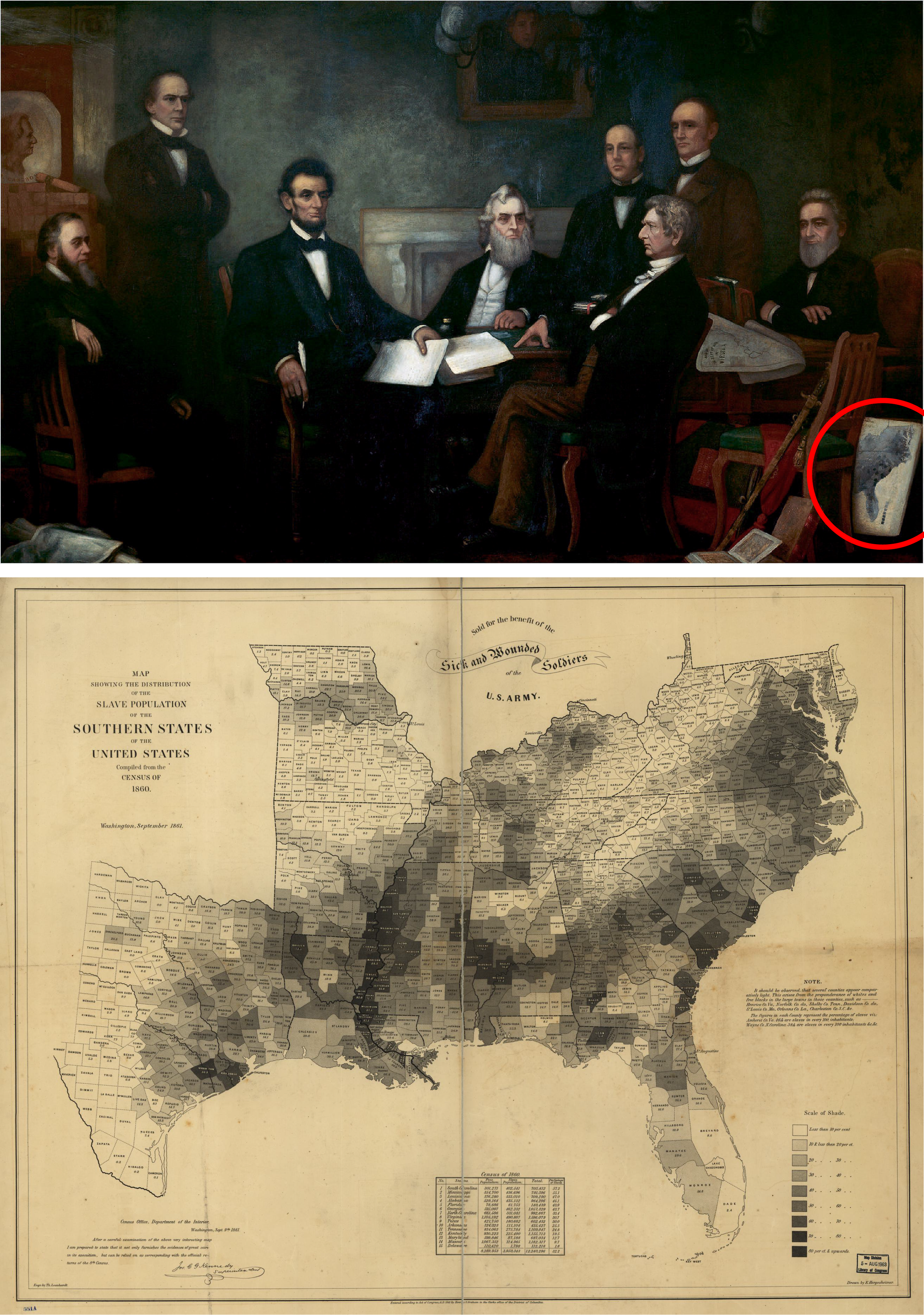
Since I wanted to include this map in my painting, I took it one day without the President knowing, and because copying it was slow and tiring work, it stayed in my studio for some time. This happened during the same week as Kilpatrick’s great cavalry raid in Virginia. One afternoon the President came in alone, as he often did, since watching the painting’s daily progress seemed to give him a kind of pleasure. Before long, his eyes landed on the map leaning against a chair, just as I had left it after studying it. “Ah!” he said. “So you have taken my map have you? I have been looking all around for it.” And with that he put on his glasses, picked up the map, walked to the window, sat down on a trunk, and began to study it very carefully. He pointed out where Kilpatrick had last been reported and said:
“It’s exactly as I thought. He is close to —— County, where the slaves are the thickest. Now we should get a ‘heap’ of them, when he returns.”
This version of the story is, in fact, an AI rewrite of the real version below. I worked with GPT 5.2 to generate it, prompting it in particular to simplify and update the language and punctuation sentence by sentence, rather than across the entire story. This allowed me to view and veto GPT’s choices as they were made—it seemed to think, for example, that contractions are always simpler, which is ridiculous—and of course it helped me maintain the author’s intended construction and effect of the story’s telling.
Wishing to introduce this map into my picture, I carried it off one day, without the President’s knowledge, and as the copying of it was a tedious affair, it remained in the studio for some time. This chanced to be during the week of Kilpatrick’s great cavalry raid in Virginia. One afternoon the President came in alone, as was his wont,—the observation of the daily progress of the picture appearing to afford him a species of recreation. Presently his eye fell upon the map, leaning against a chair, as I had left it after making the study. “Ah!” said he, “you have appropriated my map, have you? I have been looking all around for it.” And with that he put on his spectacles, and, taking it up, walked to the window; and sitting down upon a trunk began to pore over it very earnestly. He pointed out Kilpatrick’s position, when last heard from, and said:—
“It is just as I thought it was. He is close upon —— County, where the slaves are thickest. Now we ought to get a ‘heap’ of them, when he returns.”
The story comes from the memoirs of Francis Bicknell Carpenter, who painted First Reading of the Emancipation Proclamation of President Lincoln, an image that adorns the cover of Doris Kearns Goodwin’s book Team of Rivals, and which hangs in the U.S. Capitol building—fortunately escaping the defacements from chemical spray, spray paint, and blood left on other works of art in the wake of the events of January 6, 2021. At the lower right of the painting is the very map that Carpenter ‘borrowed’ and which President Lincoln so covetously and earnestly studied that afternoon, by the window in the painter’s studio.
From Radical Cartography: How Changing Our Maps Can Change the World, by William Rankin:
It’s a huge canvas, nine feet by fifteen feet, and it took Carpenter six months to complete it. He worked from a temporary studio in the White House during the spring and summer of 1864, with the Civil War still raging, having negotiated special access to Lincoln, his cabinet members, and the various props used in the scene. It depicts the private meeting of July 22, 1862, when Lincoln first presented his plan to order the freedom of all those enslaved in Confederate-controlled territory . . . .
Carpenter had meticulously reproduced a map showing the geography of enslavement at the time of the 1860 census. Lincoln consulted the map regularly throughout the war, with Carpenter reporting that it “usually leaned against a leg of his desk or table and bore the marks of much service . . .” Every county in the South is shaded to show the enslaved as a percent of the total population. The darkest counties were over 80 percent enslaved, while slaves made up less than 10 percent of the counties left blank . . . The map is dated September 1861, and the note at the top reveals its allegiance: “Sold for the benefit of the Sick and Wounded Soldiers of the U.S. Army”—the army of the North.
Having set the stage now with a story, and historical and art-historical meanings, we are empowered to investigate more deeply if we are so motivated (see Susan Schulten’s work, for example). But we can also make connections to geology and climate.
A delta, for example, is a place at the end of a river where the river slows down, spreads out, and drops the mud and sand it was carrying. Although many deltas have triangular shapes—like the Greek letter delta (Δ) which gives them their name—the Mississippi delta (the dark region on the map following the Mississippi River into the Gulf of Mexico), which, most precisely, is only that part of the river in southern Louisiana, does not. Yet, the alluvial soil created by its deposits, similar to what is produced in other deltas around the world, is conducive to the growth of cotton plants, the cash crop that fueled the economies of Southern slave plantations. Similarly, one can clearly locate the Alabama Blackland Prairies (the Black Belt) on the map—a region which owes its cotton-loving soils to a unique geology, active over millions of years. These features are visible, even though the map is ostensibly a map of people, not one of natural terrain, a fact that speaks volumes about the inhuman machinery of slavery—and about the ‘argument’ of the map itself, which buries human beings under grasslands and silt.
Finally, let us consider mathematics and data analysis, as Rankin certainly does, and answer the questions left open by Lincoln’s comments during that afternoon when he was searching for his ‘slave map’:
It’s impossible to say how much Lincoln’s thinking was steered by the specific argument of his map, but we do know that he was confused about the difference between percent and density . . . .
In the spring of 1864, General Hugh Judson Kilpatrick marched south toward the Confederate capital at Richmond. On Lincoln’s map his route went through several medium-dark counties, over 60 percent enslaved, but the largest density of slaves—where the enslaved were in fact “thickest”—would have been found in the county containing Richmond itself, which was shaded much lighter but had far more people. In fact [the] map includes this important note in the margin:
It should be observed that several counties appear comparatively light. This arises from the preponderance of whites and free blacks in the large towns . . .
The very first example [it] lists, Henrico County, is home to Richmond. The way the map is drawn, Lincoln could never have known where his generals would find the most slaves.
But wait, let us think critically. Is Rankin correct in this criticism? Lincoln doesn’t say ‘most numerous’; he says ‘thickest,’ which both percent and density can answer to in many circumstances.
When analyzing maps, we use the term density to mean something like “concentration” (not mass per volume) across area. Do the map’s darker and lighter regions represent higher and lower concentrations of enslaved people across the United States in 1860? Actually, no, they don’t. They show higher and lower percents—out of total populations—within each county, regardless of the total population of the county. A county with a population of five and an enslaved population of three would have a ‘60%’ shading, the same as a county with a total population of 500,000 and an enslaved population of 300,000. We would of course counsel Lincoln to not be equally excited about both counties as targets for his generals. Density, on the other hand, would show—for example—the number of enslaved people per square mile. The difference between the two is the answer to the question ‘number of people per what?’ And this difference is much more important than we may think for all acts of data organization and interpretation:
Percent of total, population density . . . What ultimately distinguishes them . . . isn’t the difference in the patterns they show, but what I call their visual denominator . . . each option has its own distinct spatiality. I call this a visual denominator because it suggests reading a map as a kind of visual fraction: data pattern per X, where X is the kind of space implied by the features on the map. Enslavement per jurisdiction; enslaved per square mile; enslavement per hundred thousand people. Figuring out X is an act of interpretation, and most maps are a mix, but it’s crucial not just for knowing what questions a map can answer but also for understanding its overall argument about how the world is structured. Ideally, numerator and denominator share some obvious relationship—laws or votes per jurisdiction, forests per land area, mortality per person—but often they don’t. (Think of all the maps of COVID cases per land area.)
No educator, of course, would describe the work we went through above—or its result—as a ‘lesson.’ That term more closely describes what is known as the ‘enacted’ curriculum (or ‘implemented’ curriculum)—what is actually taught in the classroom. But it is also not a set of standards, a godawful lesson ‘plan,’ a ‘progressions’ document, a ‘framework,’ a blueprint, a playbook, etc., which all belong more or less to the ‘intended’ curriculum, which is, today, either a set of bulleted clinical instructional goalposts or a set of broad aspirations, like social justice, impossible to reach except in the most shallow and anemic of ways.
This gulf between the intended and enacted curricula—with nothing substantive in between—is why we have the worksheet mill of TeachersPayTeachers and the spreadsheet social justice of education publishers and developers (and bought adoption-committee members), who consider it mission accomplished to simply put Kobi and Leah into the same tired contexts of bake sales and quilt drives, but now they’re raising money for the unhoused instead of a field trip.
There is nothing intelligent happening between intention and action. The conductors are waving their batons, and the choir is singing, but no one has any sheet music. These talented musicians rightly deserve praise for producing some semblance of formative music for the audience year in and year out. It’s a downright miracle. But we shouldn’t, for obvious reasons, continue to rely on miracles.
To achieve its potential effectiveness and efficiency, educational intention must be composed into knowledge, which is then enacted through instruction. The ‘composed’ curriculum, then, I would propose, is a (missing) phase of curriculum design in which educational intentions are shaped into a coherent knowledge composition—integrating disciplines, representations, and learning science—so that the whole can be meaningfully decomposed, sequenced, and enacted over time. It is where educational vision is tamed and becomes intelligible form—structured enough to endure decomposition, yet flexible enough to support interpretation, professional autonomy, and growth.
The ‘composition’ I have created above—connecting history and art history, geology and climate, and data science and math is not intended to represent a perfect or universally ‘good’ example of this phase of curriculum development. I mean only to make you feel what is missing in education and hint at what could be to fill its place, with the hope that you ache for something like this too.
What composition offers is not control, but, perhaps, an instructional metric space—a geometry. It makes it possible for teachers to see what they are doing while they are doing it, and for students to sense that what they are learning has distance, direction, weight, stance, and a relation to other things worth knowing. Knowledge acquires a shape, one that can be entered, revisited, manipulated, and inhabited, not merely performed and discarded.
Without this phase, we will continue to swing between abstraction and improvisation—between intentions so elevated they cannot guide action and practices so improvised they cannot accumulate meaning. With it, something more formative becomes possible: a geometry of instruction, within which educational intention can be worked into knowledge that holds its shape over time—knowledge that teachers can inhabit professionally and students can return to, recognize, and build upon, rather than merely encounter and leave behind.